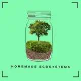
Homemade_ecoystems
patreon
For those who followed my previous post:
Most of you choose the thumbnail with the door so I tried to improve it a bit (let me know if it is worse than the previous one 😅). I have made a few different versions. Let me know which one you like best!
Thank you!


I would say the first one with dark wood and maybe a darker background
#3. The light blue definitely pops.
I might be a little late but I think light blue looks great.
i think the 3rd one looks better because the vibrancy of the insect n door n background whatchamacallit pops out n contrasts with the background. the first one may be eyecatching but its a bit distracting
Contrast is key on thumbnails. Basically exaggerate with colours
Its 3 for me. Also idk how but you rly let the earwig stand out as you said