hatton_slayden
patreon
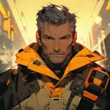
i am trying to be more efficient with my work flow but not sacrificing any quality

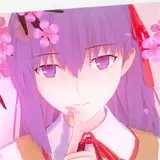
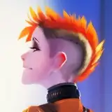
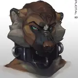
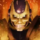
Sorry for being shoddy. I forgot about this incomplete comment here. Been having pretty busy weeks. Anyway. It's the chiaroscuro effect. Basically this one here has a lot more contrast. You seemed to give more weight to the "cell" shading as opposed to the watercolor. But it just was that thw watercolor has nigh zero contrast, making it seem too flat. On average i like watercolor, but if it has too little contrast it either feels too flat or washed out, for some reasons, though, many people associate watercolor with delicate low contrast. I was busy that fay and went for the quick version. 😅
rightoh. can you tell me why? if i start coloring even my folios this way it pays to understand why some styles work
if i have to say i prefer this style